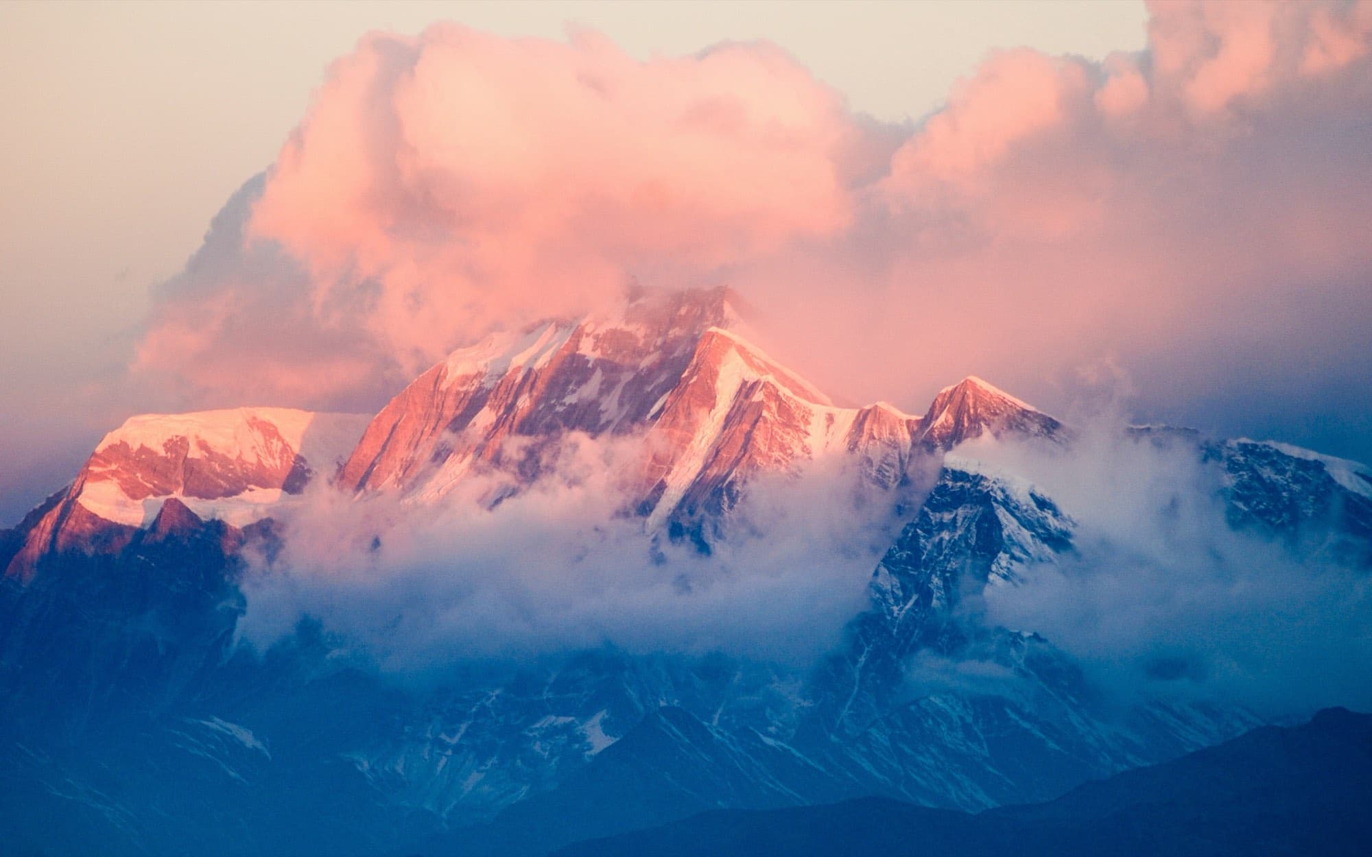
9 themes for your booking website
Each theme lays out the same trips, dates and reviews in its own way, from photo-led to catalogue-first. Every theme is included, you can switch whenever you like, and nothing you've written is lost when you do.
Screenshots show a sample trekking company with the theme's suggested colour. Your logo, colours, photos and trips replace them.
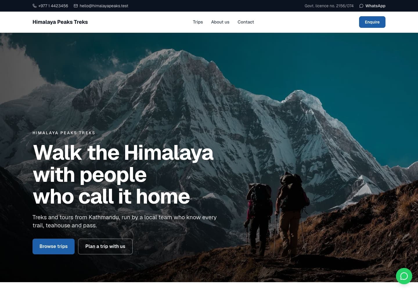
Summit
Bold and photographic: full-width images, strong headlines and plenty of space.
- Best for
- Trekking companies with strong photography and a short list of signature trips.
- Type
- Geist and Geist · soft corners
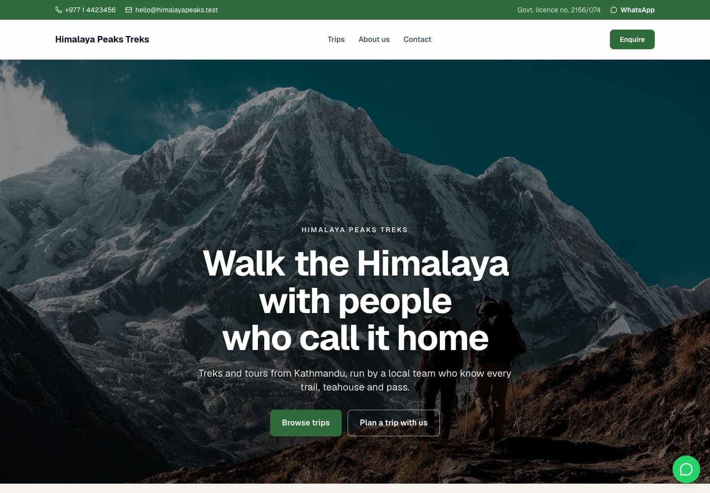
Basecamp
Classic and reassuring: denser pages, trust badges up front and your phone and WhatsApp always in view.
- Best for
- Established local agencies that win on licences, memberships and reviews.
- Type
- Geist and Geist · soft corners
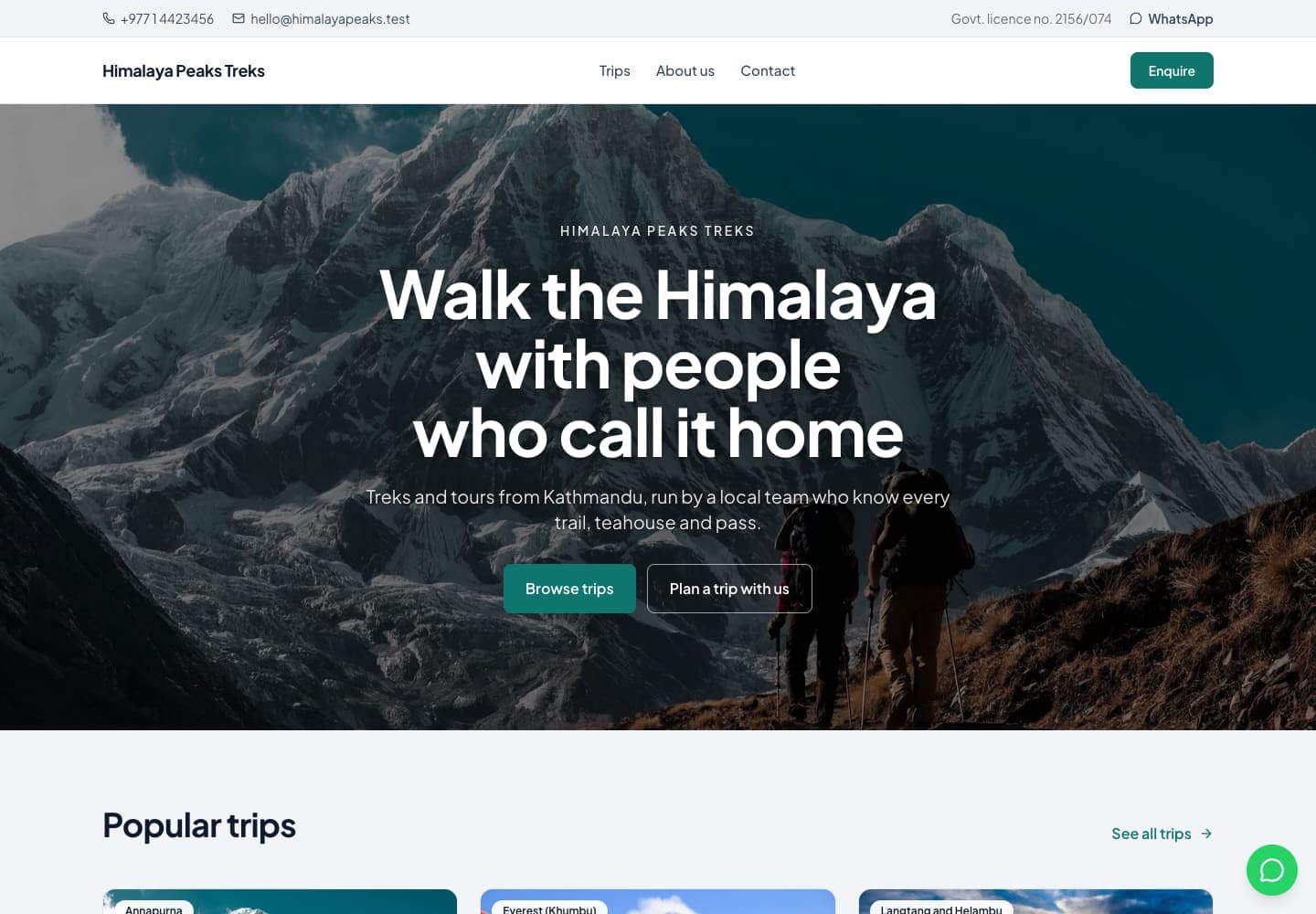
Atlas
Catalogue first: a compact search-led opening, dense trip cards with every fact, built for comparing.
- Best for
- Agencies with dozens of trips across regions, where travellers arrive to filter and compare.
- Type
- Plus Jakarta Sans and Plus Jakarta Sans · soft corners
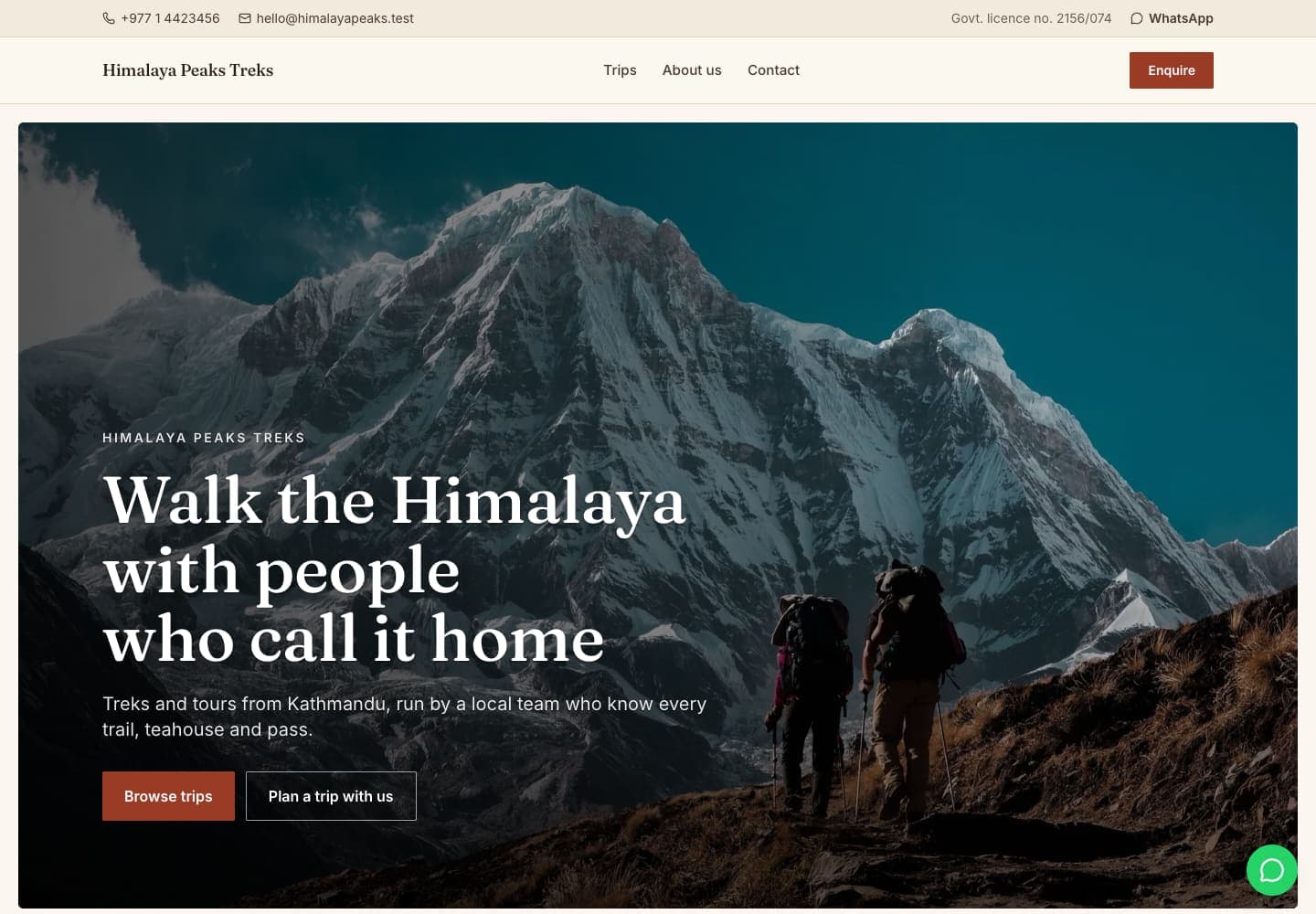
Heritage
Editorial and warm: serif headlines, cream paper and framed photographs, paced like a travel magazine.
- Best for
- Cultural, pilgrimage and heritage tours, and companies that sell through storytelling.
- Type
- Fraunces and Inter · sharp corners
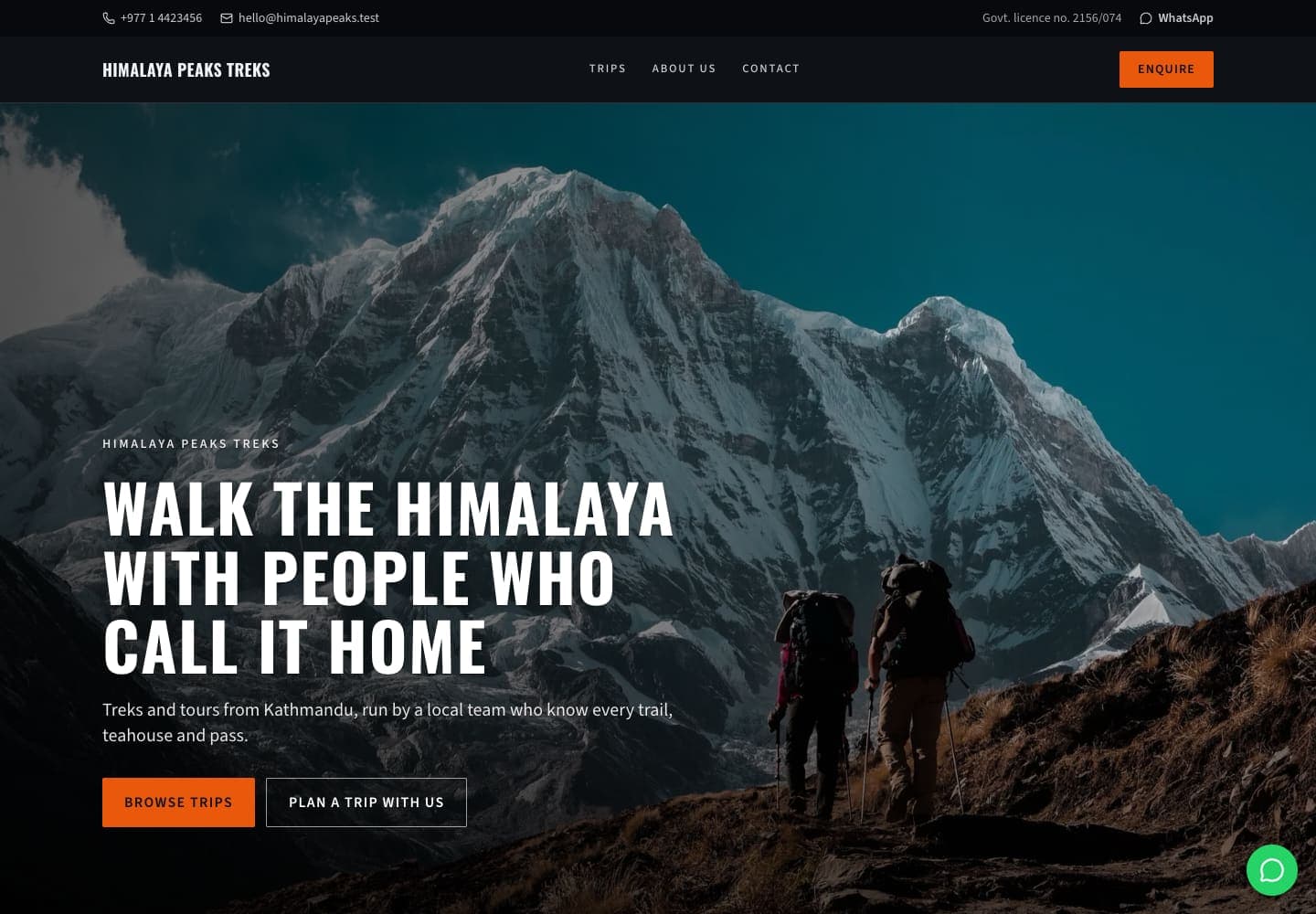
Alpine
Dark and technical: high contrast, condensed capitals and altitude, grade and days on every card.
- Best for
- Expedition and peak-climbing operators whose clients read the numbers first.
- Type
- Oswald and Source Sans 3 · sharp corners
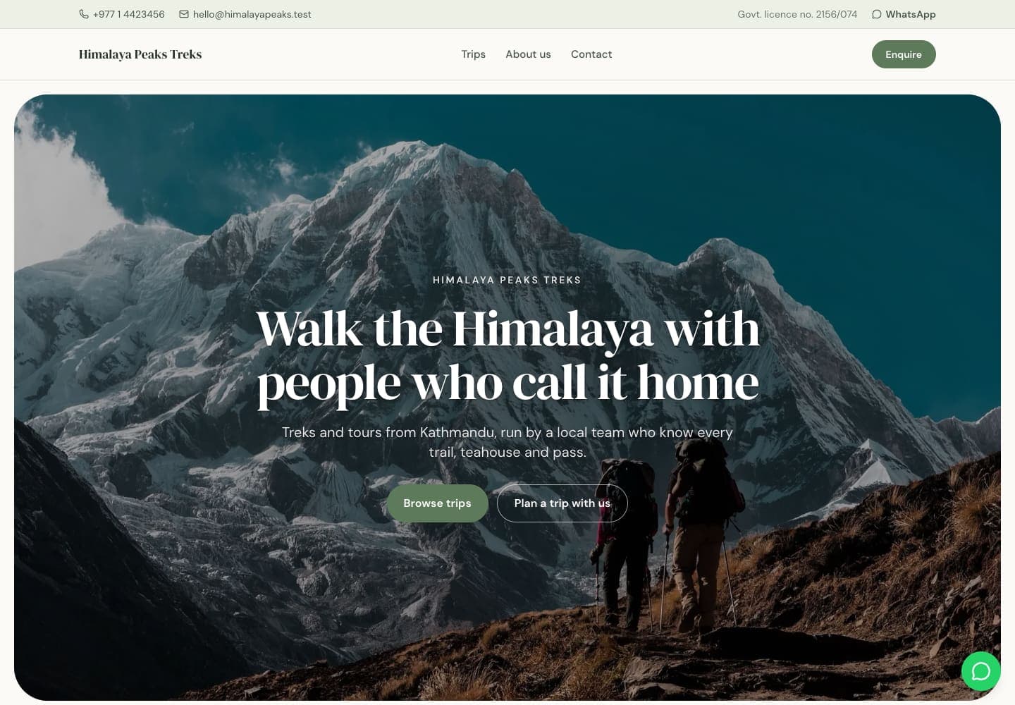
Retreat
Calm and soft: muted natural tones, rounded photographs and generous breathing room.
- Best for
- Wellness, yoga and eco travel, family trips and gentle walking holidays.
- Type
- DM Serif Display and DM Sans · round corners
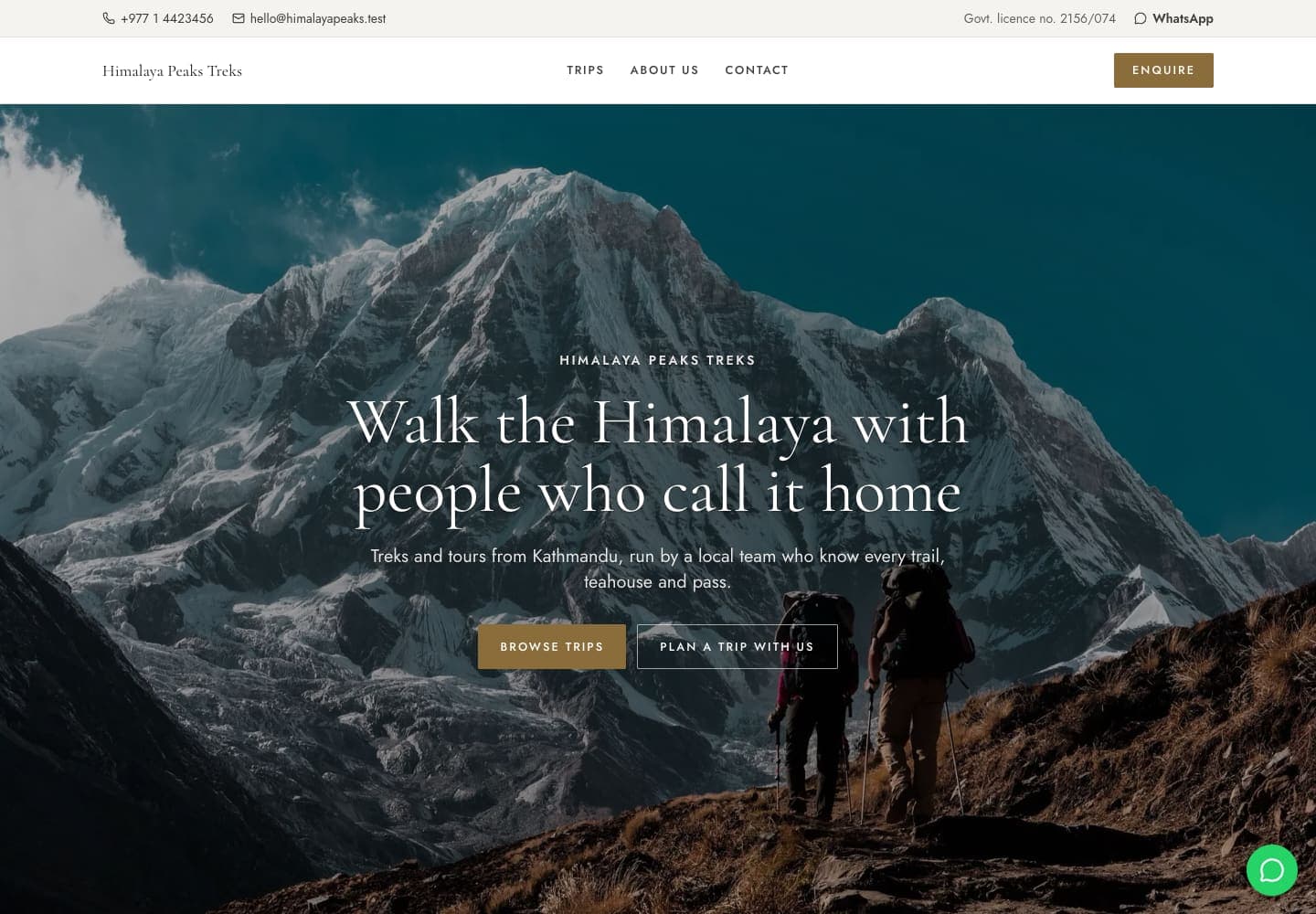
Signature
Minimal and unhurried: light type, wide margins and tall photographs, with the enquiry before the price.
- Best for
- Luxury lodge treks, private guiding and tailor-made journeys.
- Type
- Cormorant Garamond and Jost · sharp corners
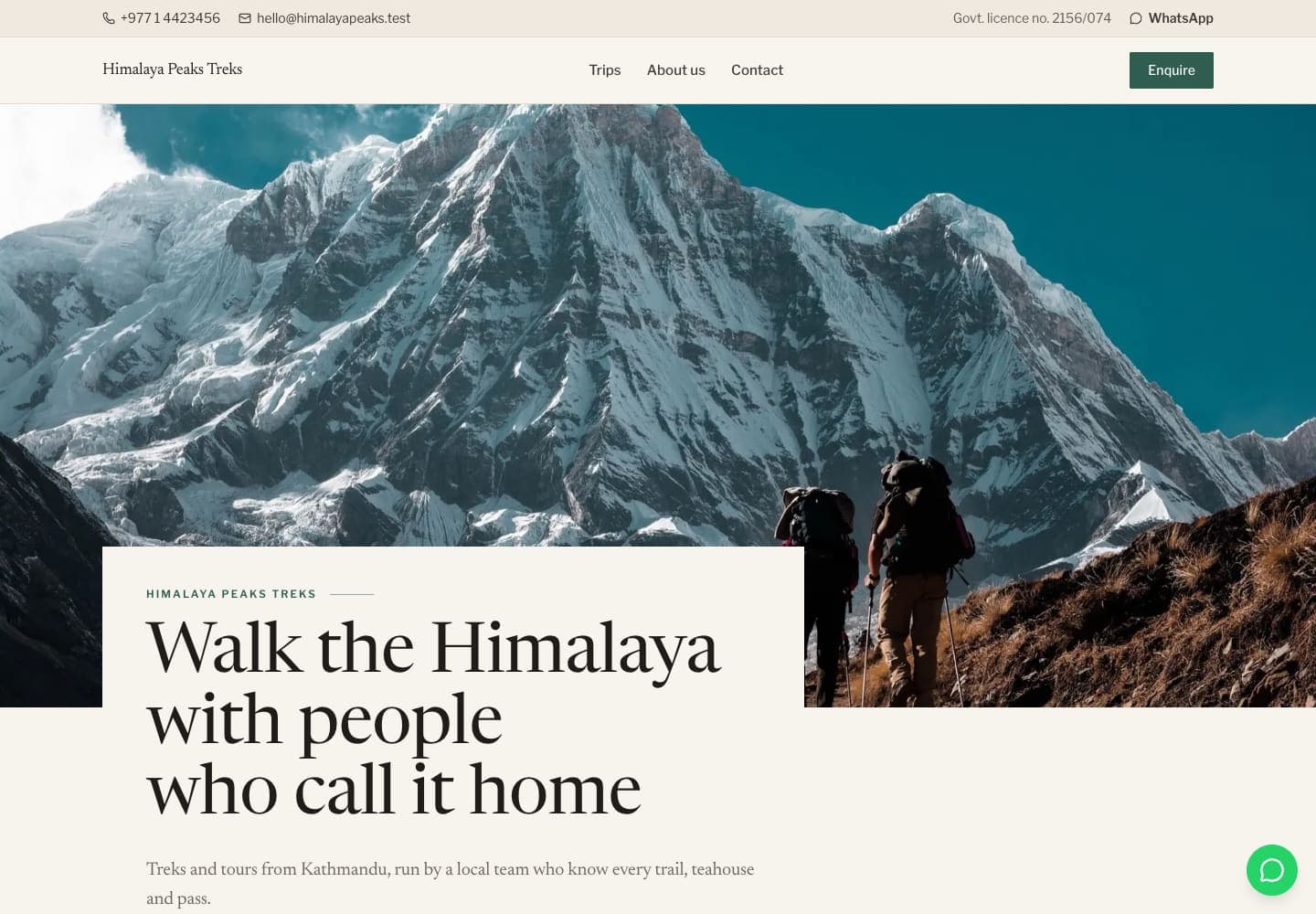
Journal
Editorial and assured: a newspaper serif, photographs with the title card laid over them, trips told like stories.
- Best for
- Companies that sell on local knowledge and storytelling, from teahouse treks to cultural tours.
- Type
- Its own fonts and corners
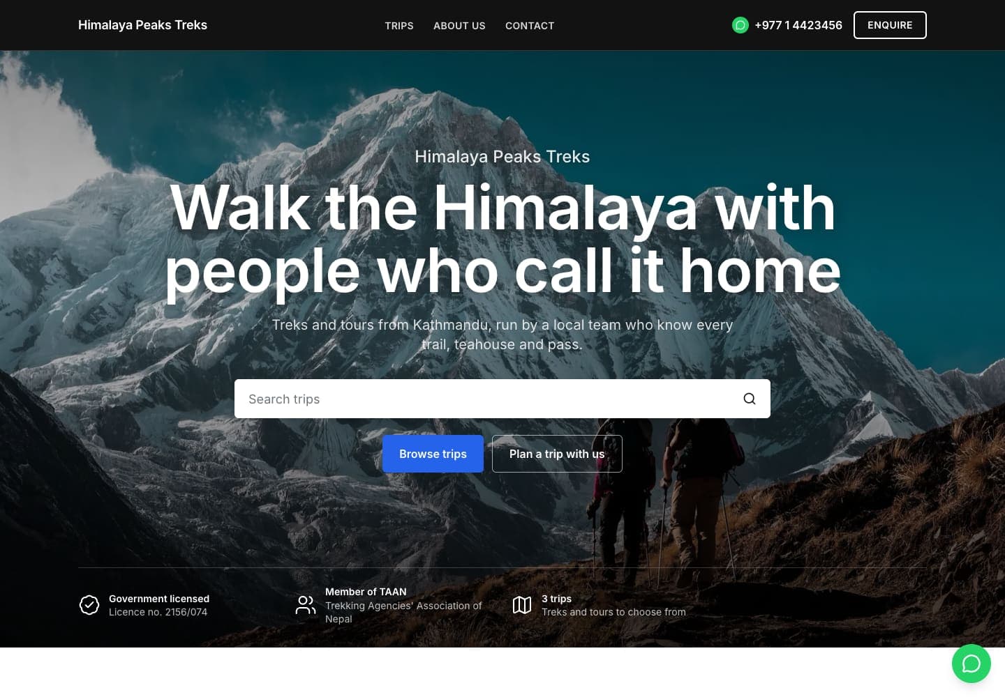
Pinnacle
Confident and conversion-led: a black header, search and proof points on the opening photograph, trust up front and a price table beside every trip.
- Best for
- Established agencies with many reviews and a long trip list, where travellers arrive ready to compare and book.
- Type
- Its own fonts and corners
Ready before the spring season
Set up your company this afternoon and have your trips, dates and booking site live by the weekend.